Getting Started Tutorial
Get Started with Your First Analysis
The simplest way to get comfortable with Datameer’s capabilities is to use this short tutorial to make your first analysis. In ten minutes, you can go from CSV data to a meaningful analytical infographic. For this tutorial, you calculate and visualize the average age of sample users based on the city they live in.
Working with this Tutorial
These instructions can be found in PDF format by opening Datameer X and double-clicking the 'GetStartedTutorial.pdf' file. Open to download this file and follow the instructions.
INFO: To download the complete PDF, click the file below.
Part One: Workbook Analysis
INFO: In this section, you add data to your workbook and use some functions to prepare your data for visualization.
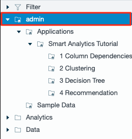
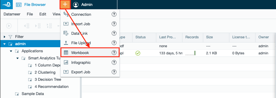
- Select your home folder in Datameer`s ‘File Browser’ ('admin' in this case).
- Select “Workbook” from the ‘+’ menu in the top bar. The ‘Add Data’ windows opens.
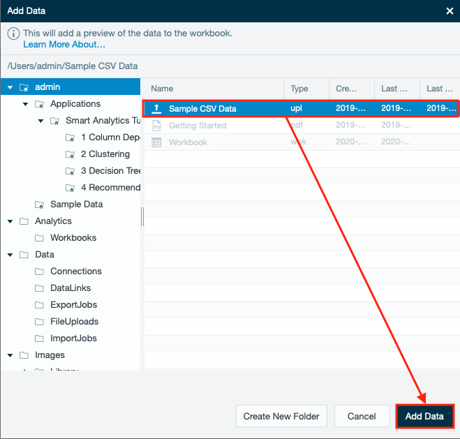
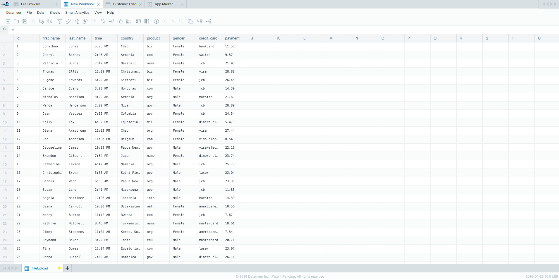
- Click “Sample_CSV_Data”and select "Add Data". The workbook opens with the sample data.
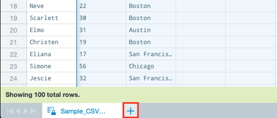
- Click the “+” icon next to the sheet name ‘Sample_SCV_Data’ at the bottom of the workbook to create a new sheet. The new sheet opens.
- Select the "Fx" tab (formula editor) in the 'Workbook Inspector'. The 'Workbook Inspector' switches to the 'Formula Inspector'.
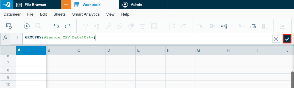
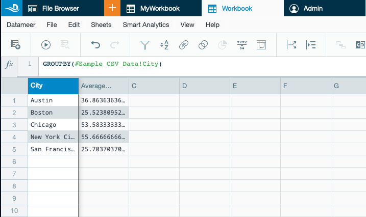
- Select the “Grouping” category from the column on the left and select “GROUPBY” to combine the different values and group them together so the data is more easily parsed.
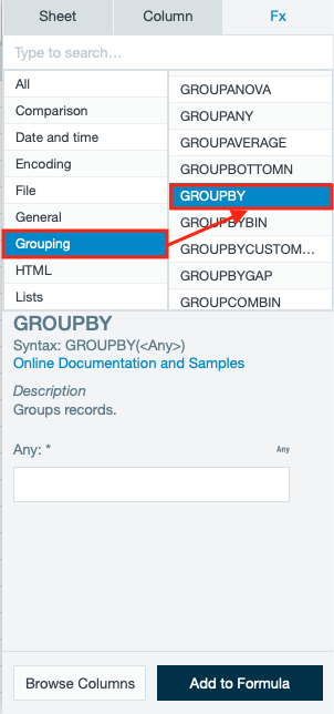
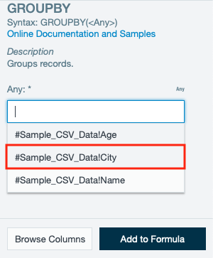
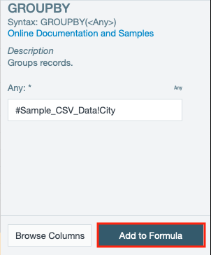
- Add the argument for 'City' by selecting the “#Sample_CSV_DataCity” from the drop-down.
- Confirm with "Add to formula". The formula is displayed in the sheet.
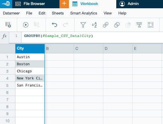
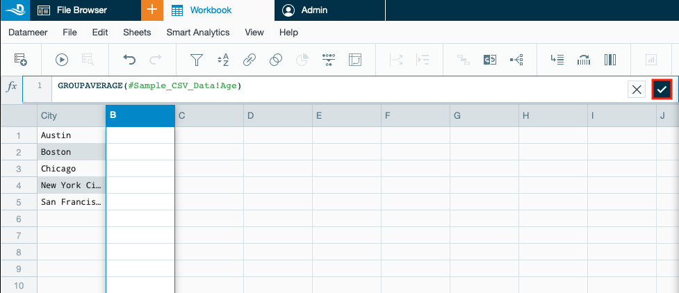
- Confirm the formula by clicking the check mark. A new ‘City’ column appears on ‘Sheet1’.
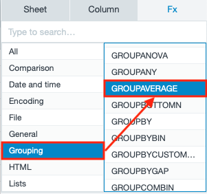
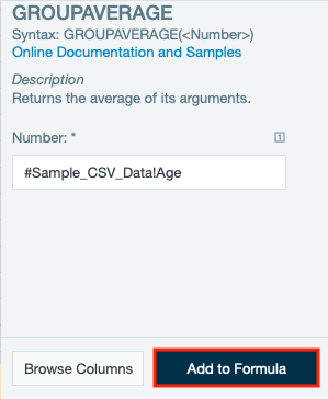
- Select the “Grouping” category from the column on the left and select “GROUPAVERAGE” to calculate the average of another column (in this case 'Age') for that grouping.
- Add the argument for 'Age' by selecting the “#Sample_CSV_DataAge” from the drop-down.
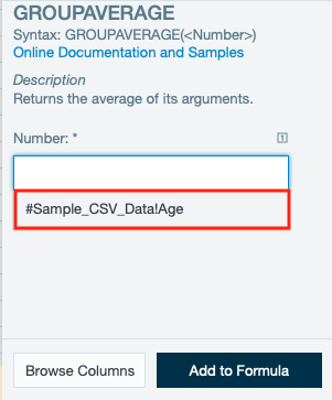
- Confirm with "Add to formula". The formula is displayed in the sheet.
- Confirm the formula by clicking the check mark. A new ‘Average’ column appears on ‘Sheet1’.
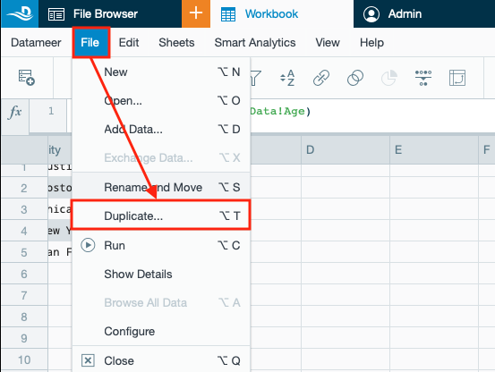
- Select "File" and then "Duplicate". The 'Duplicate' dialog opens.
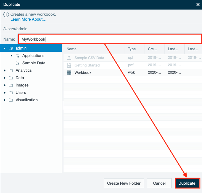
- Name your workbook (in this case 'MyWorkbook') and confirm with "Duplicate". The results are displayed in the workbook.
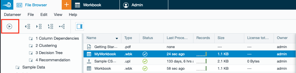
Click on the "Run" icon to run the workbook. The workbook proceeds. Part One is finished.
Part Two: Create a Visualization
INFO: Now that you've prepared your data, making a visualization helps you see relationships in the data. Datameer X offers many different types of graphs and charts, but for this tutorial, you use a multi-bar chart to find the relationship between ‘Age’ and ‘City’ location.
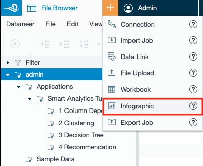
- Select your home folder in the ‘File Browser’ (in this case 'Admin').
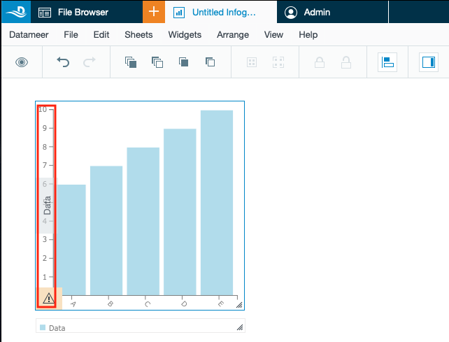
- Select “Infographic” from the ‘+’ menu in the top bar. The tab 'Untitled Infographic' opens.
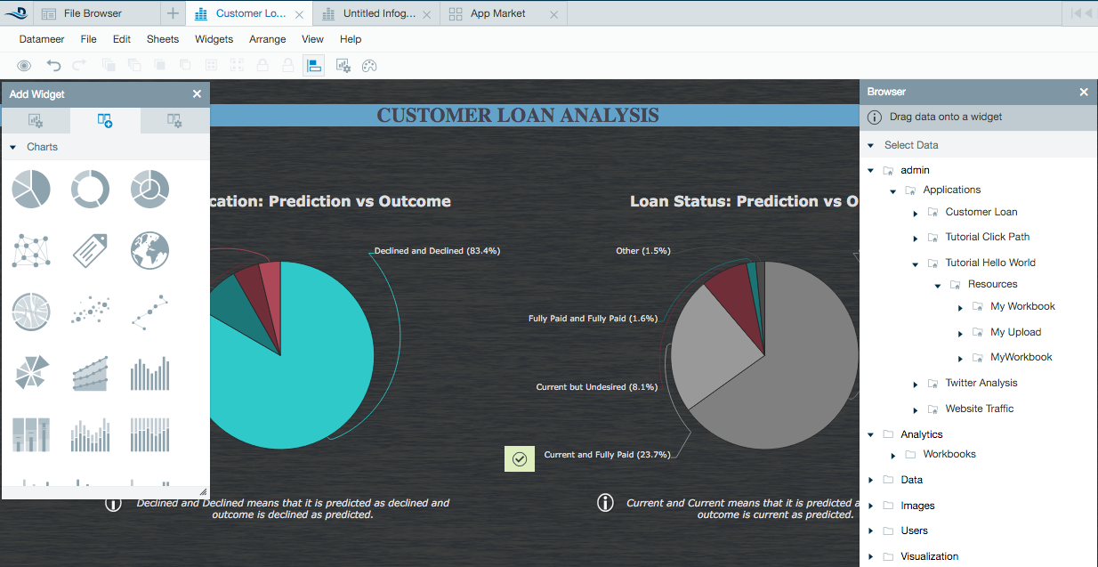
- Select ‘Multi-bar chart’ from the ‘Widget’ tool box on the right and drag and drop it to the middle of the page. An empty multi-bar chart is displayed.
INFO: A multi-bar chart is a great choice because it shows the simple relationship between the data.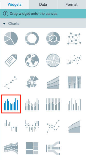
- Click the “Data” scale on the widget to show which properties need to be entered for the configuration.
- Navigate to the “Data” tab in the 'Infographic Inspector' on the right. From there, browse to your home folder → "Sample CSV Data" → “Latest Results” -> “Sheet1” by clicking the arrow next to the name.
INFO: If your workbook is still running, wait for the results. If it hasn`t run yet, right-click the workbook in the ‘File Browser’ and select “Run” from the tool bar.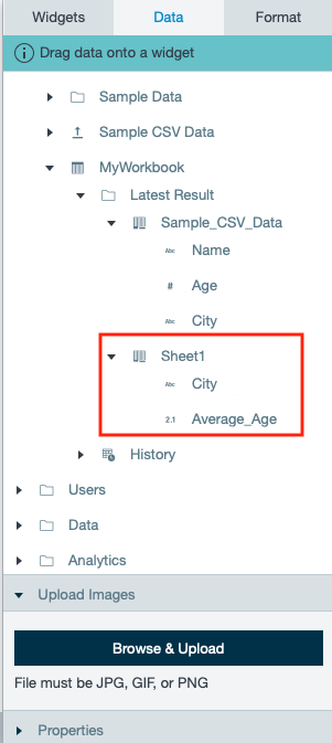
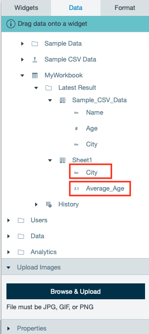
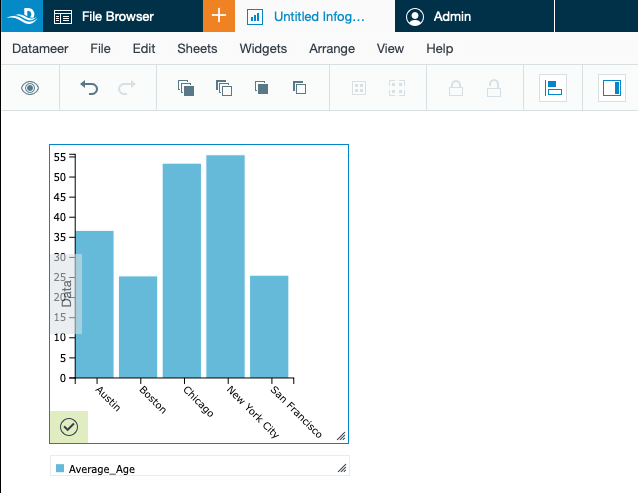
- Drag the ‘City’ column to the ‘Label’ field and the ‘Average Age’ column to the ‘Data’ field of the widget. The updated widget now shows you the relationship between ‘Age’ and ‘Location’.
- Click off the chart to close the ‘Data’ tab and view the chart, which shows you that the average age in New York City is the oldest of the cities included. Hover over the columns to see the information.
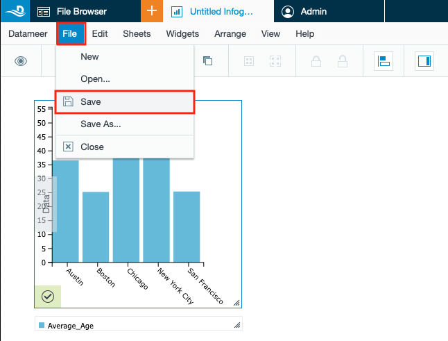
- Select “Save” from the ‘File’ menu.
- Name your infographic (in this case 'Infographic') and confirm with “Save”. Part 2 is finished.
INFO: If you close your infographic and want to view it again, open the infographic in the ‘File Browser’ by double-clicking the name of your infographic to view your chart.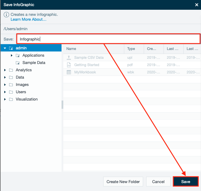
Congratulations!
You've now performed your first analysis!
Enjoy exploring Datameer X and for more information and help along the way, check out our user documentation.
Exploring the Workspace
When you first log in, you see that you are under the File Browser tab. In the File Browser, you can quickly move among data sets, workbooks where you create analytics, and infographics where you create reports and visualize your data. You can also open multiple tabs to navigate between the different worksheets with ease.
File Browser Navigation Bar
From the navigation bar on the left side of the screen you can easily move through the folders where files are saved in Datameer X and see information relating to your files. From here you can set up connections, import jobs and export jobs, work with workbooks, set up data links, and create infographics.
To get started using Datameer X right-click on the page, choose Create new and make a selection. You can also use the + (plus) button to make a quick selection and open a new tab.
Import data
Create workbooks
Create and edit workbooks.
For workbook shortcuts, see /wiki/spaces/DASSB110/pages/20221232013.
Visualizing data
Datameer's infographic tools help you create informative and exciting visual displays of your data.
Admin Tab
The Admin tab (which is only available if your account has administrator permissions) provides access for configuring job settings, underlying data settings, permissions, and user settings. The Datameer X administrator sets the permissions for your account specifying the read and write access for the available data sources, workbooks, and infographics.